Menu
Napalm death
NAPALM DEATH
PROJECT
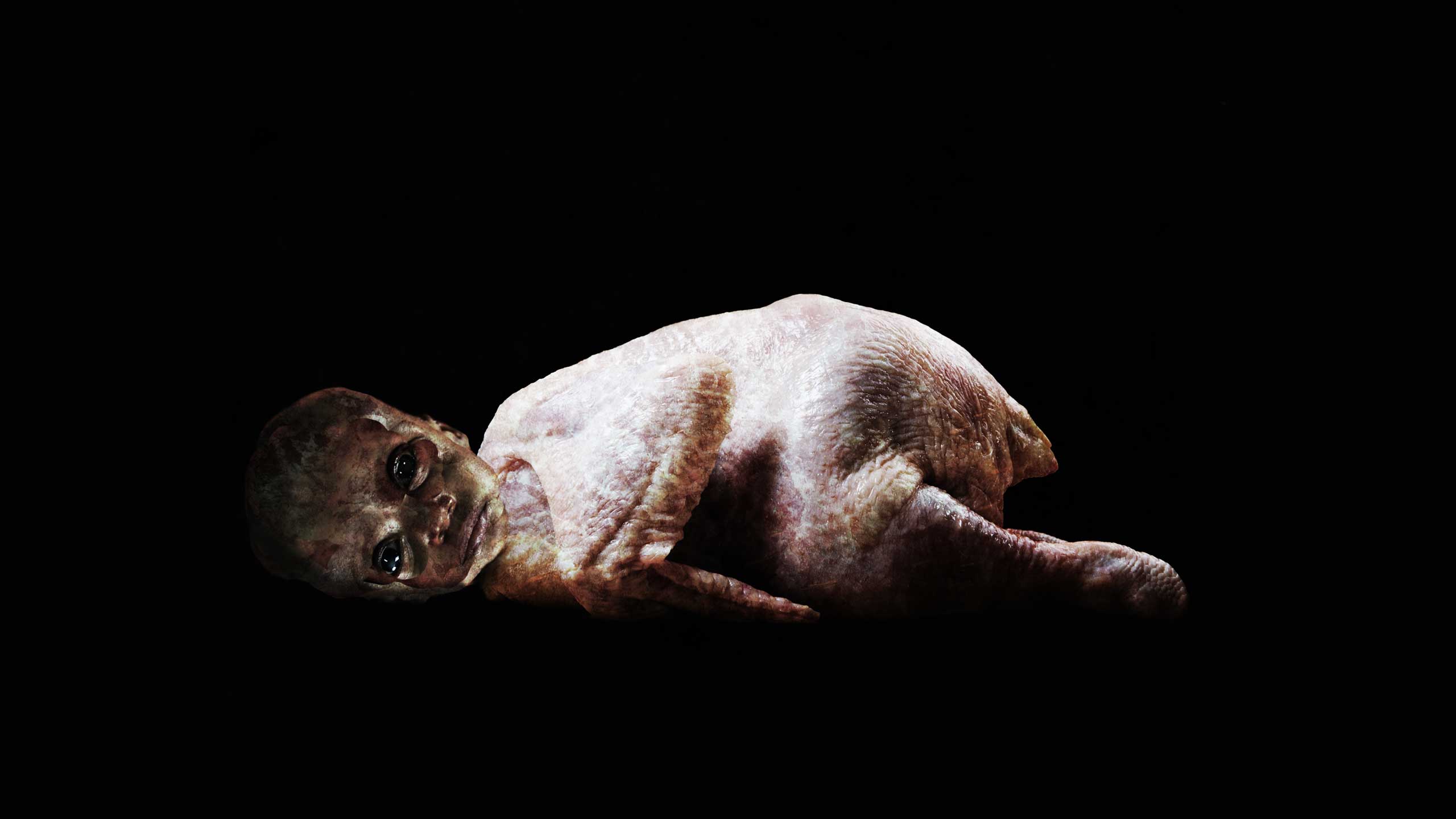
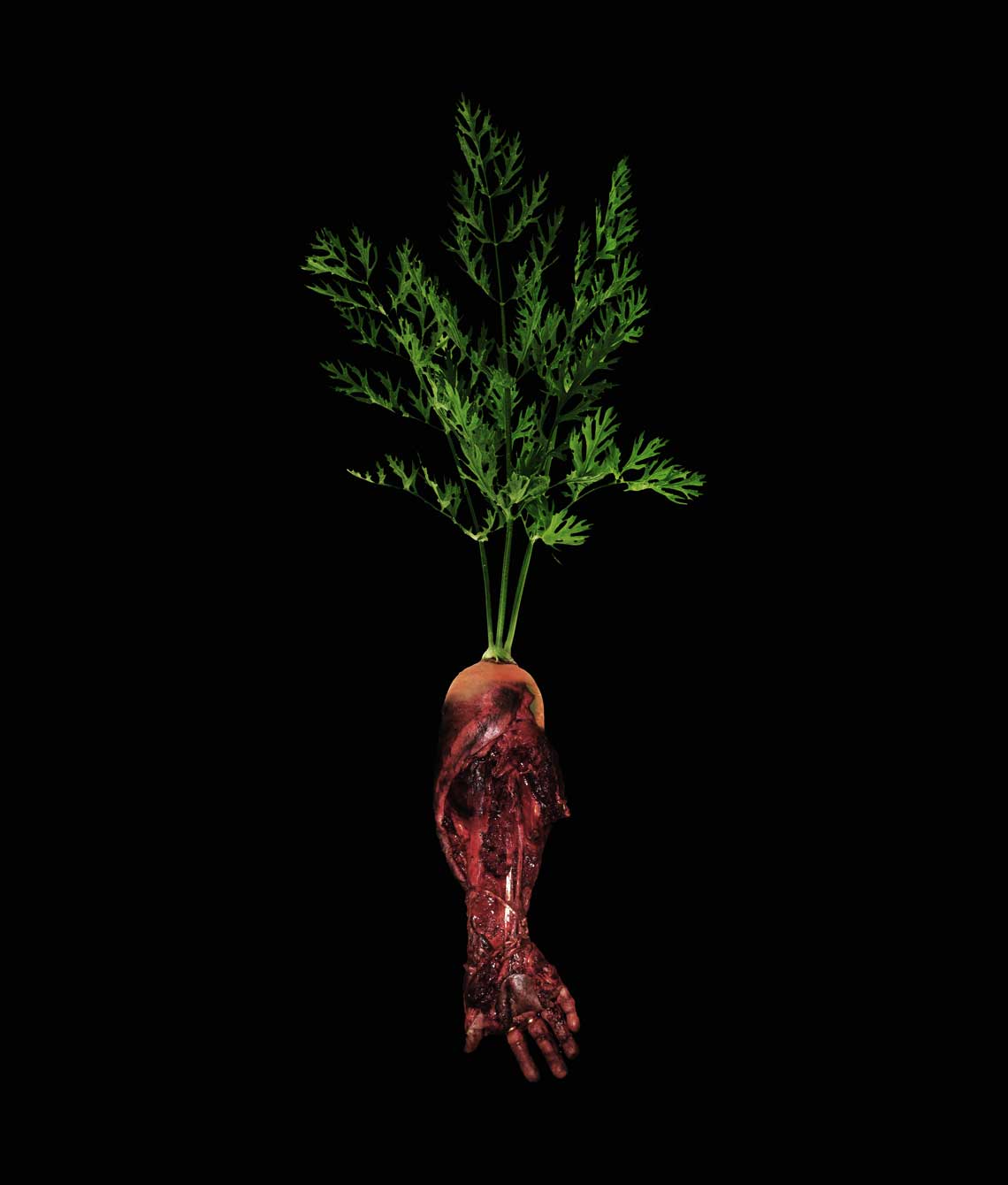
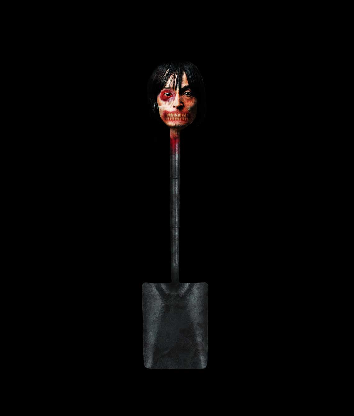
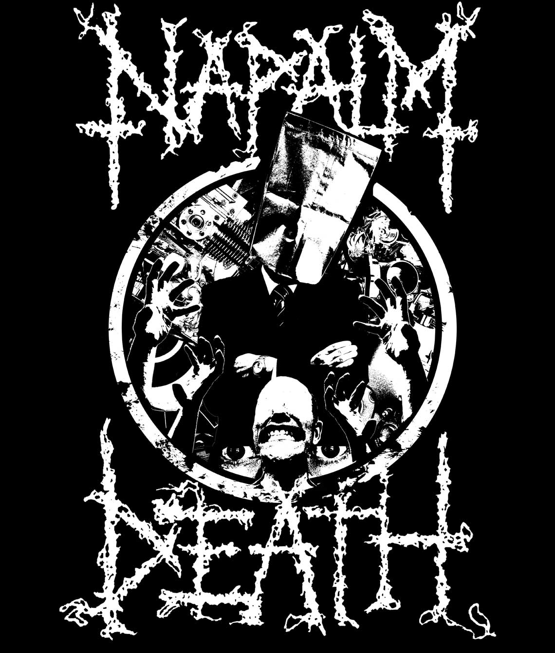
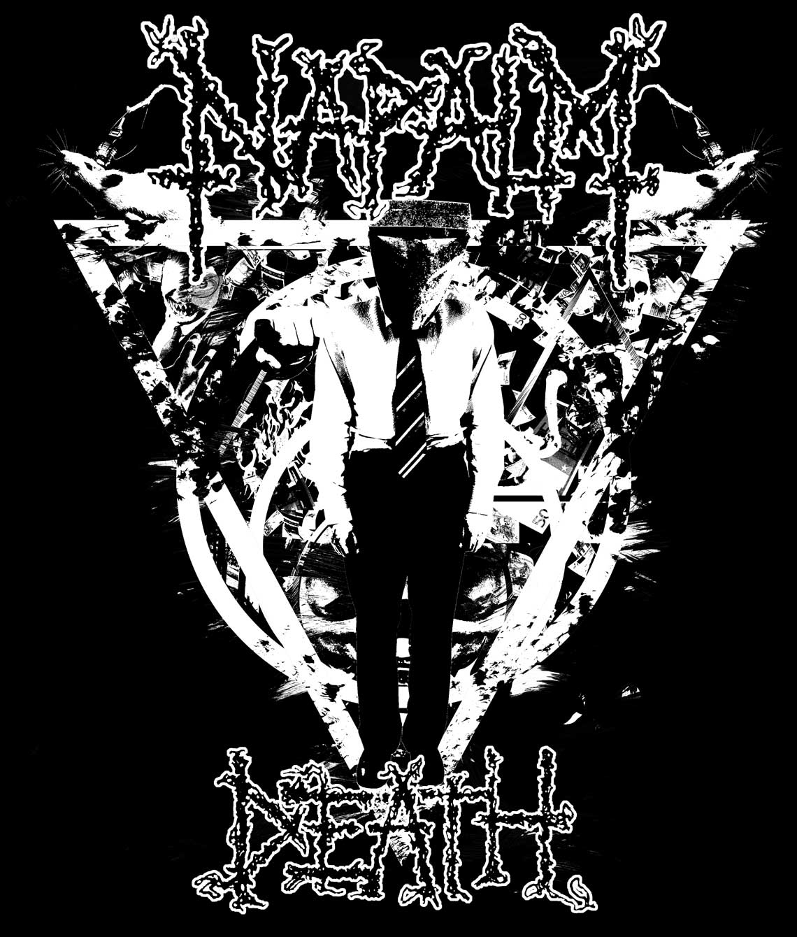
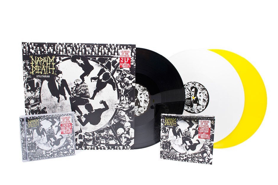
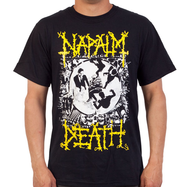
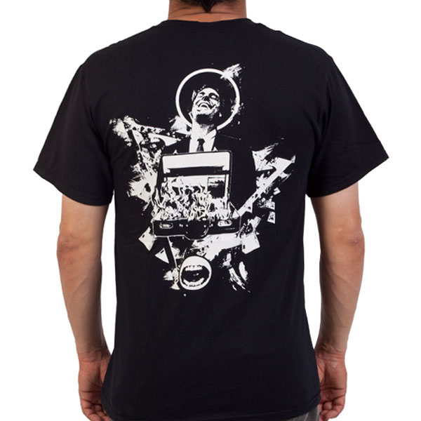
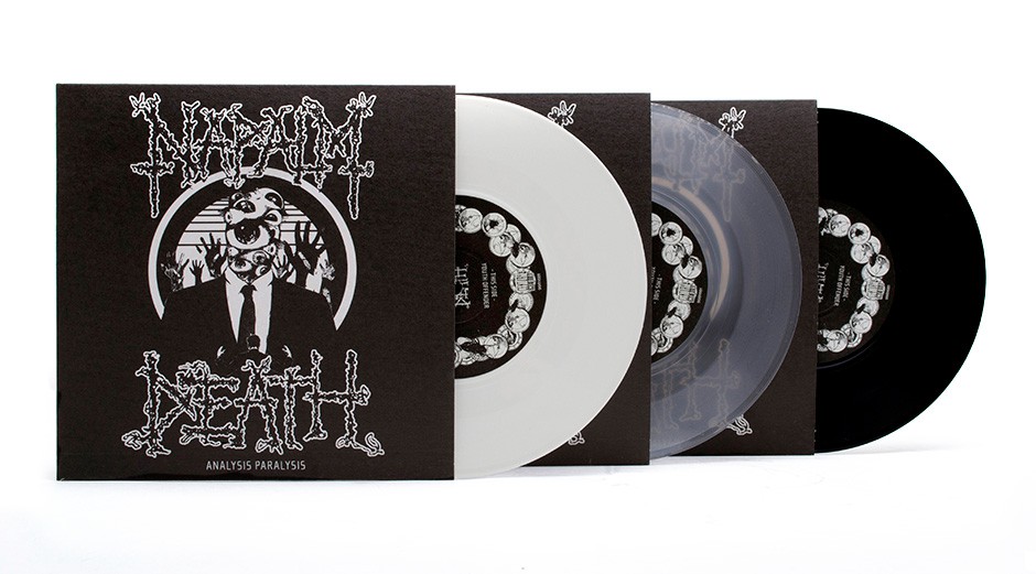
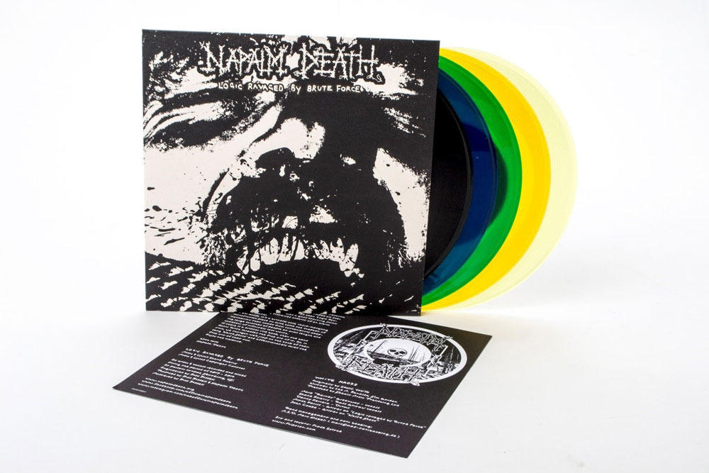
Concept devolpment and designing album art for napalm death lp, cd, and singles
CREDITS
Client : Napalm Death
Media : CD / LP Covers
Creative : Frode Sylthe
Art Direction: Frode Sylthe
Graphic Design: Frode Sylthe
Bureau : Friktion
Copyright : Friktion
PROJECT
Concept devolpment and designing album art for napalm death lp, cd, and singles
CREDITS
Client : Napalm Death
Media : CD / LP Covers
Creative : Frode Sylthe
Art Direction: Frode Sylthe
Graphic Design: Frode Sylthe
Bureau : Friktion
Copyright : Friktion
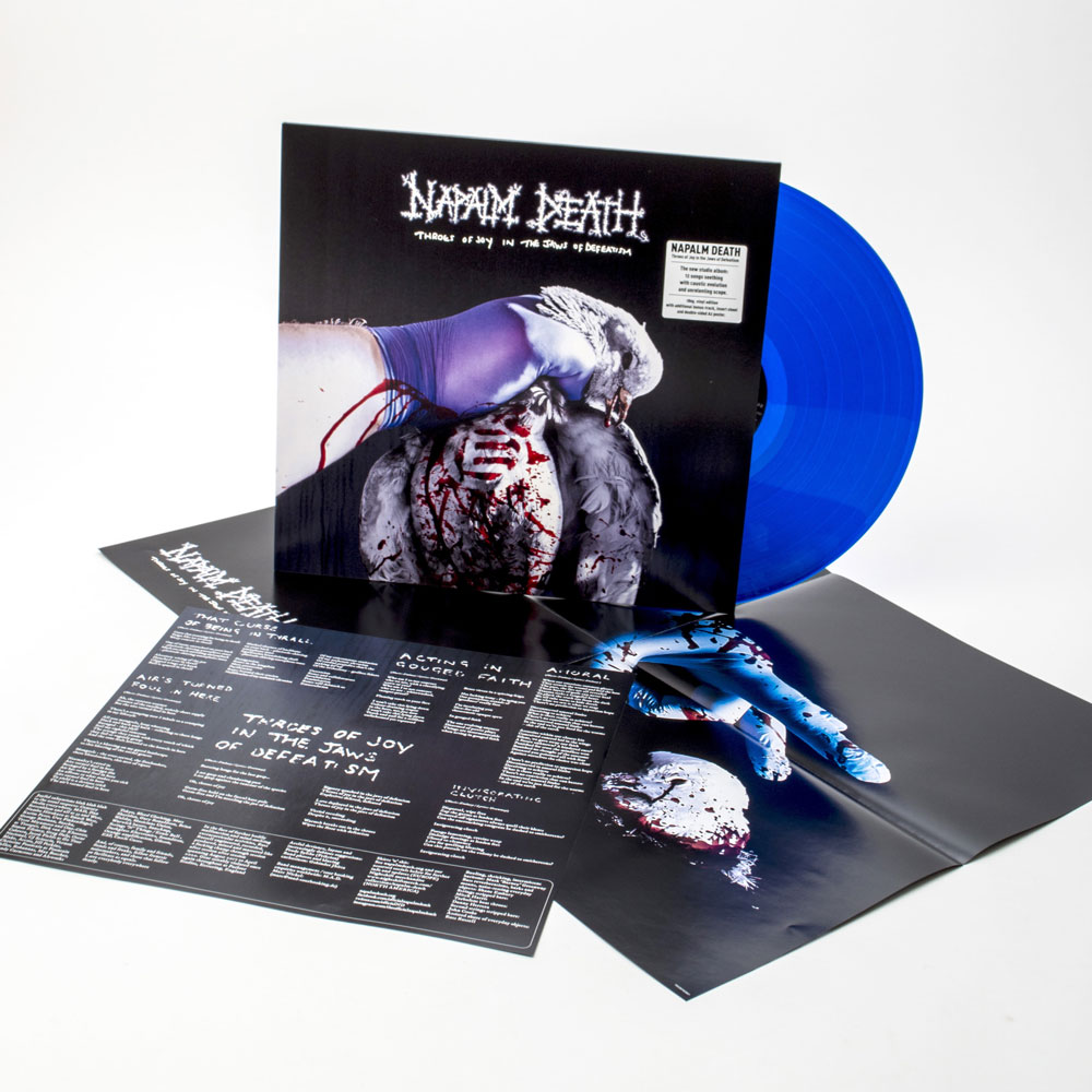
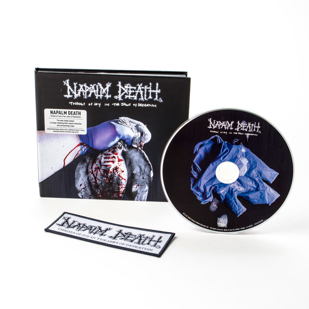
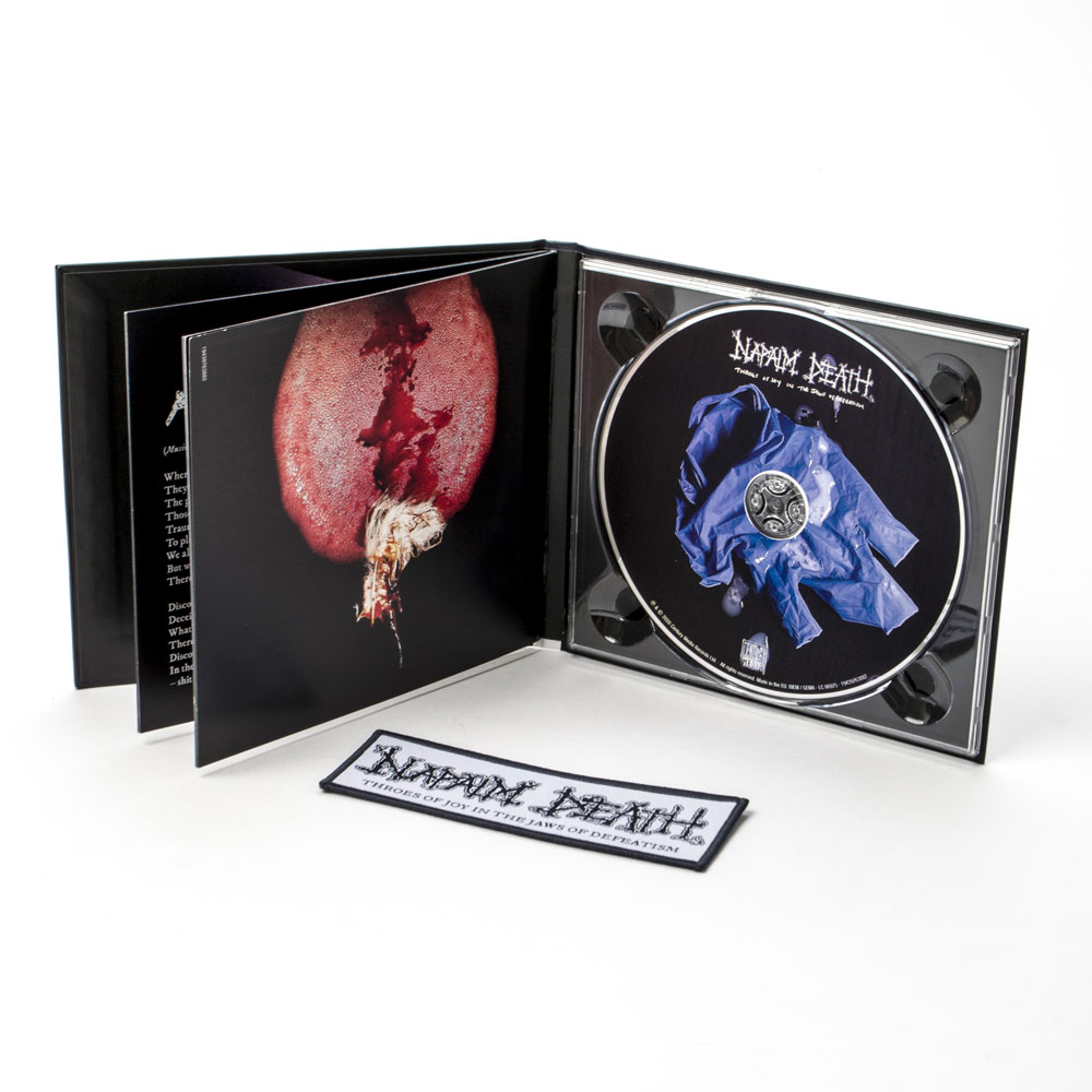
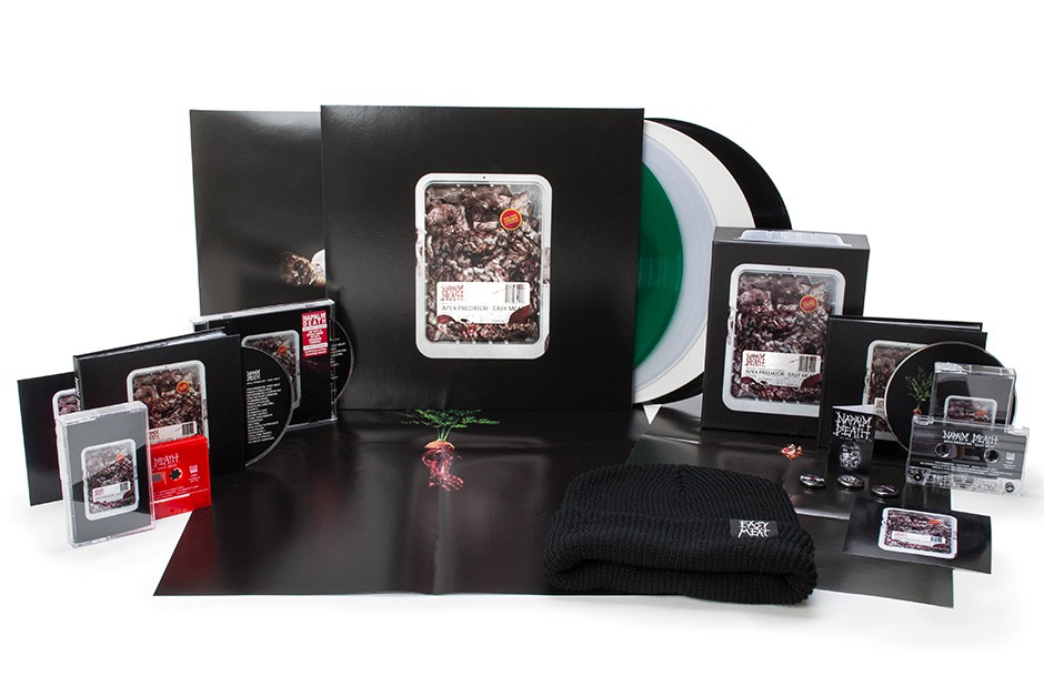
Apex Predator – Easy Meat
British/American grindcore legends NAPALM DEATH will release their 15th studio album, “Apex Predator – Easy Meat”, on January 27, 2015 (one day earlier internationally) via Century Media Records. The CD’s striking artwork, which can be seen below, was created by Danish designer Frode Sylthe (Friktion.com), who has previously worked on the band’s “Utilitarian” album as well as with such other acts as AT THE GATES, TOTALT JÄVLA MÖRKER, THE HAUNTED and BURST.
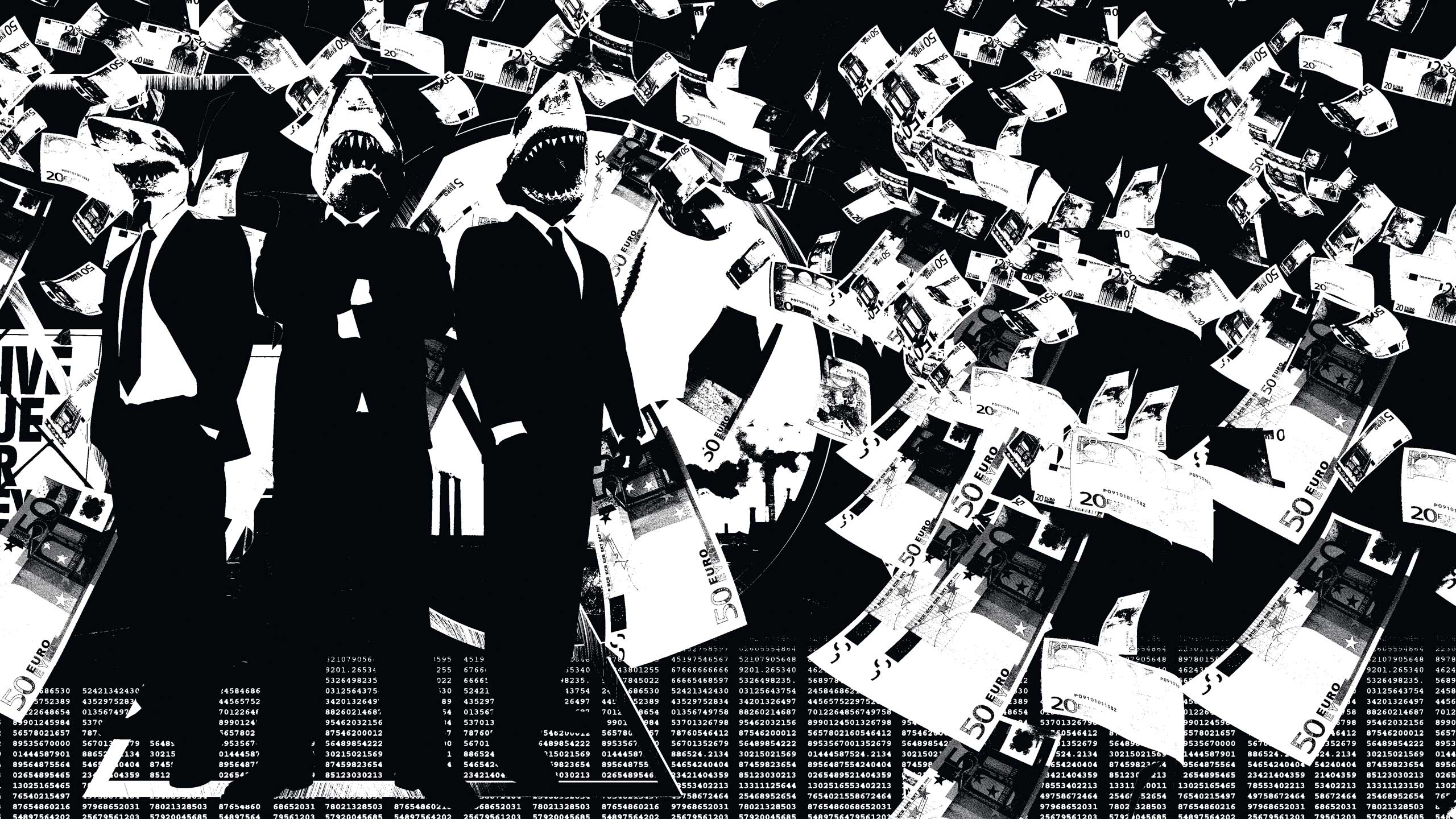
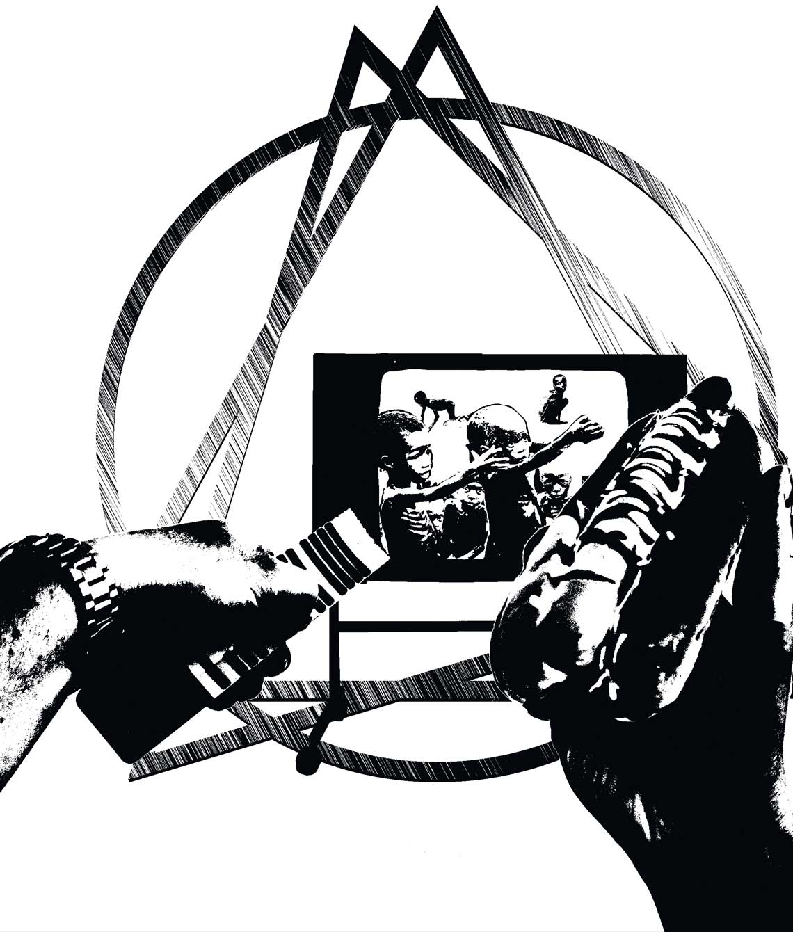
Comments NAPALM DEATH bassist Shane Embury: “There are many meanings that you could grab from the new album artwork, I think. But one is the representation of how our natural and most basic needs for happiness and communication are being stripped away by materialism and pre-packaged garbage — crap that we don’t need, filtered to us through the media via the megacorporations with the goal to maintain the bloated bottom line of profit. It’s all just stuff that will be obsolete in six months time. And behind the scenes, of course, modern-day slavery is alive, well and obscured by this facade. It’s all an exercise in deceit to shower us with fake fulfilment, while the poor and underprivileged fall further by the wayside.”
Adds NAPALM DEATH singer Mark “Barney” Greenway: “Across the albums, we have had some very complex and interconnected artwork. This time we wanted to keep it more simple — strip it down perhaps to a single image that would sharpen the focus.
“I loved the idea of the supermarket-style packaging as soon as I saw it, as when you go into one of those places with nourishment in mind and you’re greeted with some miserable, artificially enhanced foodstuff contained in a bleak little receptacle of industrial plastics, it doesn’t exactly inspire you. To then fill that plastic tray with the dregs of meat production, well, that is the ‘easy meat’ in the title — representing the people who suffer for burgeoning consumption degraded and dumped in the most pitiful way.”
———————————————————————————————————————————————
Review:
Napalm Death are awesome. Napalm Death’s new album, Apex Predator – Easy Meat is awesome. Frode Sylthe‘s cover art for that album (below) is awesome. Sylthe also did the album art for ND’s Utilitarian, which was awesome, but this is more awesome. I just think the way it incorporates all the necessary info onto a package of meat is awesome. And the fact that that meat is really gross brains and stuff is awesome. And the sticker promising “tenderised [sic/British/whatever] chunks” is awesome. Awesome awesome awesome:
www.metalsucks.net
———————————————————————————————————————————————
Review:
Napalm Death’s new album Apex Predator – Easy Meat comes out January 15 and we’ve already got a taste for that particular brand of blood with a new song from the group. So what else could make us excited for the record besides some new music? How about this totally awesome, not violent cover art for the album which really captures the band’s peace-loving, warm, fuzzy…
Ah shit. I got “vegan” and “carnivore” mixed up again, didn’t I? Or perhaps this is just cannibalism? I’m assuming the band went the Cattle Decapitation route and just threw some human meat in there. It DOES say there’s pulverized chunks of a weakling behind that plastic…
The band once again commissioned Danish designer Frode Sylthe for the gig! He’s done well with the band in the past and and continues to live up to his reputation.
Speaking of vegans, did you see that list of metal bands who are vegan we posted last week?
Read more at www.metalinjection.net/
———————————————————————————————————————————————
In anticipation of the release of the band's NEW album, below is the track listing for the album and right next to these words is the amazing album cover that Frode Sylthe designed.
http://hornsuprocks.com/news_view_full.php?id=2892#.VH7OytYuftY
———————————————————————————————————————————————
The song, the concept, the art. Everything is just flawless
-Kira Michelz
Says Barney Greenway of the record and the cover art:
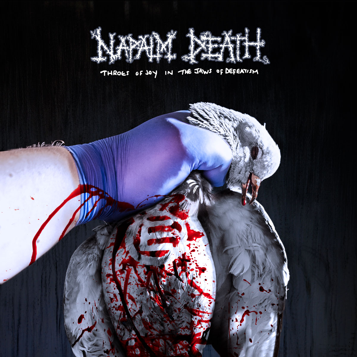
“The phrase sticking in my mind when I started thinking about the lyrical direction for this album was ‘the other.’ You could recognize at the time that there was a rapidly growing fear and paranoia being generated about everybody, from migrating people to people with fluid sexuality and this was starting to manifest itself in very antagonistic reactions that you felt were almost verging on violence. Not everybody resorts to such reactions of course, but even the basic lack of understanding can become toxic over time. I’m not saying that this is an entirely new phenomenon, but it has been stoked in recent history by some particularly attack-minded people in more political circles and, as ever, I felt that it would be the natural antidote to endorse basic humanity and solidarity with all.
“The artwork specifically uses a white dove as a centerpiece, which of course is a commonly recognized symbol of peace and cooperation. The dove has been mauled very violently by a sterilizing hand and in death appears particularly broken and bloodied. However, through the violence you can see an equality symbol in blood on the chest of the dove, which perhaps demonstrates – visually at least – that equality cuts through in the end. A positive amidst many negatives then, much like the album title itself being a bit of an oxymoron – the celebration of humanity even in the mangling jaws of negativity.”
